Getting Started with CyberGISX
Prepared for AAG 2023 Workshop by Jinwoo Park
General information about Jupyter Notebook/Lab
- Cell
- Add a cell: single click on a cell --> click plus icon (+) above.
- Delete a cell: single click on the cell to delete --> Menu --> Edit --> Delete Cells
- Reorder a cell: drag cell with mouse
- Change cell type: click the dropdown list above.
- Edit cell
- Markdown: double click (basic syntax reference)
- Code: single click
- Run a cell: single click on a cell --> click play button above (or Shift + Enter).
- Run all cells: Menu --> Run --> Run All Cells.
- Clear all cell output: Menu --> Edit --> Clear All Outputs
- Kernel
- Change kernel: Menu --> Kernel --> Change kernel
- Choose versioned kernel (eg XXXXX-0.8.0) before sharing
- Restart kernel: Menu --> Kernel --> Restart (& Clear output)
- Troubleshooting
- Restart kernel: Menu --> Kernel --> Restart Kernel
- Restart CyberGIS-Jupyter (save notebook first!): Menu --> File --> Hub Control Panel --> Stop My Server --> Start Server
- More Info
Exercise (3 minutes)
Task 1: Add one new code cell after this cell.
Hint: Single click on a cell --> click plus icon (+) above.
Task 2: Change the new cell's type to Markdown, and write something in it.
Hint: Click the dropdown list above; Single click on the new cell ---> write some Markdowns see basic syntax reference; Click on the "Run" button on the tool bar.
Task 3: Uncomment the Python codes in the cell below and run it.
Hint: Single click on the cell below --> Remove the Pound sign ('#') OR
Press Shift + Enter keys together (or click on the 'Run" button on the tool bar)
Task 4: clean all output of this notebook.
Hint: Go to Menu --> Edit --> Clear All Outputs
# Task 2: Chage this cell to Markdown
'''
Task 3: Uncomment the code below.
'''
# print("Hello World")
Examining Social Vulnerability Index (SVI) in the Conterminous US
Introduction
This notebook will walk you through some basic techniques for spatial analysis and visualization in the CyberGIS-Jupyter environment. We will use CDC county-level Social Vulnerability Index (SVI) data to examine the characteristics of SVI and whether they are spatially autocorrelated.
Specifically, this notebook includes functions for
- Changing coordinate systems,
- Creating Choropleth maps, and
- Conducting Moran's I and Local Indicators of Spatial Association (LISA).
What is Social Vulnerability?
The degree to which a community exhibits certain social conditions, including high poverty, low percentage of vehicle access, or crowded households, may affect that community’s ability to prevent human suffering and financial loss in the event of disaster (e.g., a tornado, disease outbreak, or a chemical spill). These factors describe a community’s social vulnerability.
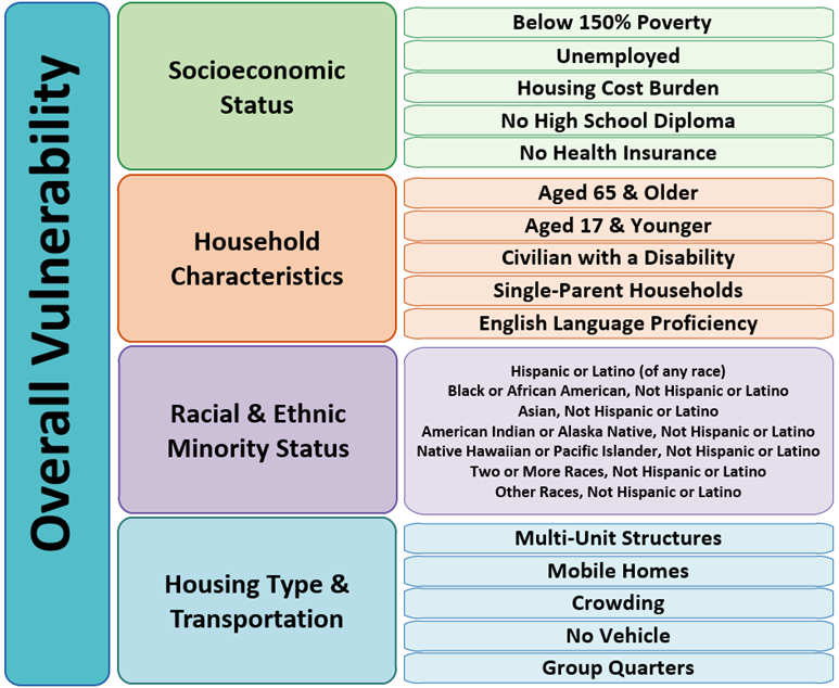
Source: https://www.atsdr.cdc.gov/placeandhealth/svi/documentation/SVI_documentation_2020.html
Setup
This cell is to import required modules and libs. A breif description on the purpose of each libs can be found below:
- pandas: for tabular data analysis and manipulation
- geopandas: extention of pandas with spatial information
- PySAL: Python Spatial Analysis Library for open source, cross platform Geospatia Data Science
- libpysal: Core package
- esda: Exploratory Spatial Data Analysis (e.g., Moran's I)
- mapclassify: Choropleth map classification
- matplotlib - for creating plots and figures
import geopandas as gpd
import pandas as pd
import libpysal
import esda
import mapclassify
import matplotlib.pyplot as plt
from matplotlib.colors import LinearSegmentedColormap

import warnings
warnings.filterwarnings('ignore')
Data Preprocessing
# Social Vulnerability per county
# Data source: https://www.atsdr.cdc.gov/placeandhealth/svi/data_documentation_download.html

# Read Shapefile into GeoDataFrame
county_svi = gpd.read_file('./data/SVI2020_US_county.shp')

# The original data has numerous columns, so we only select the necessary information
county_svi = county_svi[['ST', 'STATE', 'ST_ABBR', 'COUNTY', 'FIPS', 'SPL_THEMES' , 'geometry']]

# Call the first 5 rows of GeoDataFrame
county_svi.head()
# A CSV file that defines which states in the conterminous US

# Read CSV file into DataFrame
lookup = pd.read_csv('./data/state_lookup.csv')

# Select only necessary information
lookup['ST_ABBR'] = lookup['Abbr']
lookup = lookup[['ST_ABBR', 'ContiguousUS']]

# Call the first 5 rows of DataFrame
lookup.head()
# Merge `county_svi` GeoDataFrame with `lookup` DataFrame to select counties in the conterminous US (CONUS)
svi_conus = county_svi.merge(lookup, on='ST_ABBR')

# Select counties in CONUS (with the value of 1 in the `ContiguousUS` column)
svi_conus = svi_conus.loc[svi_conus['ContiguousUS'] == 1].reset_index(drop=True)

# We will be using this `svi_conus` GeoDataFrame for the rest of our analysis
svi_conus
# Dissolve `svi_conus` GeoDataFrame per state to obtain state-level geometry for visualization purposes
states = svi_conus.dissolve(by='STATE').reset_index()
states.head()
col_selected = 'SPL_THEMES'
# Create a map of SVI with red color scheme
fig, ax = plt.subplots(figsize=(15, 7)) # Create empty canvas
svi_conus.plot(col_selected, cmap='Reds', legend=True, ax=ax) # Plot SVI
states.boundary.plot(ax=ax, color='black', linewidth=1) # Plot state boundary
ax.set_axis_off() # remove ticks of plot
plt.show() # show plot

Changing Coordinate Systems
Geographic Coordinate System (e.g., WGS84 or NAD83) might not be a good choice for visualizing the national-level data as it could exaggerate high-latitude areas. Here, we will change the coordinate system to Alber's equal-area conic projection, the recommended projected coordinate system for CONUS.
# The original coordinate system (crs)
svi_conus.crs
# Change the coordinate system of GeoDataFrame into Albers equal-area conic projection
svi_conus = svi_conus.to_crs(epsg=5070)
states = states.to_crs(epsg=5070)
# Changed coordinate system (crs)
svi_conus.crs
# Create a map of SVI with red color scheme
fig, ax = plt.subplots(figsize=(15, 7)) # Create empty canvas
svi_conus.plot(col_selected, cmap='Reds', legend=True, ax=ax) # Plot SVI
states.boundary.plot(ax=ax, color='black', linewidth=1) # Plot state boundary
ax.set_axis_off() # remove ticks of plot
plt.show() # show plot

Various Choropleth maps with different classification methods
We will examine how the maps will be different based on the following classificaiton methods.
- Equal Interval divides the classes with equal interval.
- Quantiles has the same count of features in each class.
- Standard Deviation makes each standard deviation becomes a class (e.g., -2 std, -1 std, 1 std, and 2 std).
- Natural Breaks creates classes with maximum inter-class deviation with minimum intra-class deviation, (optimistically speaking).
# Distribution of the data
svi_conus[col_selected].hist(bins=30)

# Simple statistics of the data
svi_conus[col_selected].describe()
Exercise (3 minutes)
Choose your own color scheme for Choropleth maps
Color scheme has a huge influence on the interpretation of maps. Here, we will try to stay away from the color scheme provided by matplotlib package and use our own color scheme.
Please visit the website below and copy and paste the color scheme you like the most.
- Visit https://colorbrewer2.org/.
- Select
sequentialamong the three radio buttons on the top-left corner (It is selected by default). - Change
Number of data classesto5, and pick the color you like the most. - Expand
EXPORTbutton. - Copy and paste the hex color codes under
JavaScriptintoinput_colorsin the cell below.
# Define our own color scheme
input_colors = ['#ffffb2','#fecc5c','#fd8d3c','#f03b20','#bd0026']
my_color_bar = LinearSegmentedColormap.from_list('my_color_bar', input_colors, N=5)
my_color_bar

Choropleth map with Equal Interval Classification
This method divides the classes with equal intervals.
# Conduct map classificaiton
cls_ei5 = mapclassify.EqualInterval( # Classification method
                                    svi_conus[col_selected], # Column to be used for classification
                                   )
cls_ei5
fig, ax = plt.subplots(figsize=(15, 7)) # Create an empty canvas

# Plot a map
cls_ei5.plot(gdf=svi_conus, # GeoDataFrame that will be used for plotting
             cmap=my_color_bar, # Color bar, which was defined above
             legend=True, # Will show the associate legend
             legend_kwds={'loc': 'lower left'},  # Location of legend
             ax=ax  # Destination of the plot
            )

# Supplementary for visualization purposes
states.boundary.plot(ax=ax, color='black', linewidth=1) # Plot boundary of states
ax.set_axis_off() # Hide ticks of the plot
plt.show() # Show plot

Challenges (5 minutes)
Choose your own classifications for Choropleth maps
In this challenge, you will create three maps with 1) Quantiles, 2) Standard Deviation, and 3) Natural Breaks.
- Please visit
mapclassifyAPI website and find corresponding function. - Create three empty cells below (one for each method).
- Copy and paste the following skeleton code into the cells.
- Modify the code as needed.
HINT: YOU ONLY NEED TO REPLACE A VARIABLE, where indicated by
REPLACE_HERE.
# Conduct map classificaiton
temp_class = mapclassify.***REPLACE_HERE***( # Classification method
                                            svi_conus[col_selected], # Column to be used for classification
                                           )

fig, ax = plt.subplots(figsize=(15, 7)) # Create an empty canvas
# Plot a map
temp_class.plot(gdf=svi_conus, # GeoDataFrame that will be used for plotting
                cmap=my_color_bar, # Color bar, which was defined above
                legend=True, # Will show the associate legend
                legend_kwds={'loc': 'lower left'},  # Location of legend
                ax=ax  # Destination of the plot
                )

# Supplementary for visualization purposes
states.boundary.plot(ax=ax, color='black', linewidth=1) # Plot boundary of states
ax.set_axis_off() # Hide ticks of the plot
plt.show() # Show plot
Choropleth map with Quantiles
Please uncomment the code below and replace REPLACE_HERE with associated function (Quantiles).
To uncomment the code,
- Select the entire code in the cell.
- Use shortcut (Ctrl+/) to uncomment the code.
# cls_q5 = mapclassify.REPLACE_HERE(svi_conus[col_selected])

# fig, ax = plt.subplots(figsize=(15, 7)) # Create an empty canvas

# # Plot a map
# cls_q5.plot(gdf=svi_conus, # GeoDataFrame that will be used for plotting
#              cmap=my_color_bar, # Color bar, which was defined above
#              legend=True, # Will show the associate legend
#              legend_kwds={'loc': 'lower left'},  # Location of legend
#              ax=ax  # Destination of the plot
#             )

# # Supplementary for visualization purposes
# states.boundary.plot(ax=ax, color='black', linewidth=1) # Plot boundary of states
# ax.set_axis_off() # Hide ticks of the plot
# plt.show() # Show plot
# cls_sm5 = mapclassify.REPLACE_HERE(svi_conus[col_selected])

# fig, ax = plt.subplots(figsize=(15, 7)) # Create an empty canvas

# # Plot a map
# cls_sm5.plot(gdf=svi_conus, # GeoDataFrame that will be used for plotting
#              cmap=my_color_bar, # Color bar, which was defined above
#              legend=True, # Will show the associate legend
#              legend_kwds={'loc': 'lower left'},  # Location of legend
#              ax=ax  # Destination of the plot
#             )

# # Supplementary for visualization purposes
# states.boundary.plot(ax=ax, color='black', linewidth=1) # Plot boundary of states
# ax.set_axis_off() # Hide ticks of the plot
# plt.show() # Show plot
Choropleth map with Natural Breaks
Please uncomment the code below and replace REPLACE_HERE with associated function (NaturalBreaks).
To uncomment the code,
- Select the entire code in the cell.
- Use shortcut (Ctrl+/) to uncomment the code.
# cls_nb5 = mapclassify.REPLACE_HERE(svi_conus[col_selected])

# # Plot a map
# cls_nb5.plot(gdf=svi_conus, # GeoDataFrame that will be used for plotting
#              cmap=my_color_bar, # Color bar, which was defined above
#              legend=True, # Will show the associate legend
#              legend_kwds={'loc': 'lower left'},  # Location of legend
#              ax=ax  # Destination of the plot
#             )

# # Supplementary for visualization purposes
# states.boundary.plot(ax=ax, color='black', linewidth=1) # Plot boundary of states
# ax.set_axis_off() # Hide ticks of the plot
# plt.show() # Show plot
Compare maps
cls_q5 = mapclassify.Quantiles(svi_conus[col_selected])
cls_sm5 = mapclassify.StdMean(svi_conus[col_selected])
cls_nb5 = mapclassify.NaturalBreaks(svi_conus[col_selected])
fig, axes = plt.subplots(2,2, figsize=(18, 10))
axes = axes.reshape(-1)

class_methods = [cls_ei5, cls_q5, cls_sm5, cls_nb5]
for idx, temp_method in enumerate(class_methods):
    temp_method.plot(gdf=svi_conus,
                     cmap= my_color_bar,
                     legend=True,
                     legend_kwds={'loc': 'lower left'},
                     ax=axes[idx]
                    )
    states.boundary.plot(ax=axes[idx], color='black', linewidth=1)
    axes[idx].set_title(temp_method.name, fontsize=20)
    axes[idx].set_axis_off()

plt.tight_layout()
plt.show()

So, what's the best classification method?
While it can vary depending on the situation, the best method is considered as the one which can maximize inter-class deviation and minimize intra-class deviation.
The code below calculates Absolute deviation around class median (ADCM), and the method with minimum value can be considered the best one.
class_result = pd.DataFrame({'adcm': [c.adcm for c in class_methods],
                             'name': [c.name for c in class_methods]})
class_result.sort_values('adcm', inplace=True)
class_result.plot.barh('name', 'adcm', figsize=(10,5))

Spatial Autocorrelation
Now, we will exmaine spatial autocorrelation of SVI with Moran's I and Local Indicator of Spatial Association (LISA).
Global Moran's I demonstrates how geographical phenomena are correlated over space, meaning whether closer things is more related than distant things. The method provides an index with the range -1 to 1; namely, -1 is a strong negative spatial autocorrelation and 1 is a strong positive spatial autocorrelation.
While Global Moran's I only provides one index to demonstrate spatial autocorrelation, Local Indicator of Spatial Association (LISA), as known as Local Moran's I explains where high (i.e., HH Cluster) and low (LL Cluster) values are clustered.
w = libpysal.weights.Queen.from_dataframe(svi_conus) # Calculate spatial relationship (contiguity) of geometry
y = svi_conus[col_selected] # Value to be used for spatial autocorrelation
The following figure will demonstrate what contiguity means. Here, we use Queen's case.
svi_co = svi_conus.loc[svi_conus['ST_ABBR'] == 'CO'].reset_index(drop=True) # Select counties in Colorado
w_co = libpysal.weights.Queen.from_dataframe(svi_co)

fig, ax = plt.subplots(figsize=(10,10)) # Create an empty canvas

w_co.plot(svi_co, ax=ax)
svi_co.boundary.plot(ax=ax)
plt.show()

Calculating Moran's I
mi_svi = esda.moran.Moran(y, w)

print(f"Moran's I is {round(mi_svi.I, 3)} with p-value {round(mi_svi.p_norm, 5)}, meaning they are highly spatially autocorrelated.")
Calculating LISA
# Remove counties without adjacent county
svi_conus_ = svi_conus.loc[~svi_conus.index.isin(w.islands)].reset_index(drop=True)

w_lisa = libpysal.weights.Queen.from_dataframe(svi_conus_)  # Calculate spatial relationship (contiguity) of geometry
y_lisa = svi_conus_[col_selected] # Value to be used for spatial autocorrelation

# Calculate LISA
lm_svi = esda.moran.Moran_Local(y_lisa, w_lisa, seed=17)
# Classes of LISA
lisa_dict = {1: 'HH', 2:'LH', 3:'LL', 4:'HL'}
# Color for LISA clusters
lisa_color = {'HH': '#FF0000', # Red
              'LH': '#FFCCCB', # Light red
              'LL': '#0000FF', # Blue
              'HL': '#ADD8E6', # Light blue
              'NA': '#FFFFFF'  # Light grey
             }

for idx in range(len(lm_svi.y)):
    temp_q = lm_svi.q[idx] # Select a cluster of each row
    temp_pval = lm_svi.p_z_sim[idx] # Select p-value of each row

    if temp_pval < 0.05: # if the p-value is statistically significant (p-value < 0.05)
        svi_conus_.at[idx, 'LISA'] = lisa_dict[temp_q] # Will define local cluster
    else:
        svi_conus_.at[idx, 'LISA'] = 'NA' # If not significant, NA

svi_conus_['color'] = svi_conus_.apply(lambda x:lisa_color[x['LISA']], axis=1) # Assign color per LISA cluster
svi_conus_
fig, ax = plt.subplots(figsize=(15, 7)) # Create an empty canvas

svi_conus_.plot('LISA', color=svi_conus_['color'], ax=ax, legend=True) # Plot LISA result

# Supplementary for visualization purposes
states.boundary.plot(ax=ax, color='black', linewidth=1) # Plot boundary of states
ax.set_axis_off() # Hide ticks of the plot
plt.show() # Show plot

Interactive map
You can also examine LISA of a specific county with the code below.
svi_conus_.explore(color='color', style_kwds={'weight':0.5, 'color':'black'})