GEOG 489 Project
Introduction
1. Motivations
Food safety is a critical public health issue. In urban areas like Chicago, Illinois, government oversight of institutions that serve food to the public is important to maintain the health of the people who eat or acquire food at these institutions. Failure to follow proper health and safety codes on the part of private enterprises can lead to outbreaks of infectious and food-borne illnesses.
2. Goals
The City of Chicago plots every health inspection of a food-serving institution on a map along with the institution’s evaluated risk level (Low, Medium, High). By analyzing this data, we will be able to visualize which areas might be underserved and therefore at higher risk for poor food safety and increased risk of food-borne illnesses. We are interested to see if there is a correlation between risk level and demographic data, and will create visualizations to see how this changes. The available dataset has a decade of health inspection data, so we will be able to see if there are any long term trends, in regards to what kind of establishments are inspected more frequently, and what association there is with the demographics of the region.
Additionally, we will plot these inspection records on the Chicago road network, which will allow us to perform route efficiency analysis to maximize the number of inspections a theoretical inspector could perform. We will perform a network analysis using the restaurants as nodes, to create a visualization of the nearest restaurants to a health inspection office. By optimizing the route a theoretical health inspector might take, we could improve the efficiency of health inspections and potentially service more restaurants on a daily basis.
3. Datasets
- Shapefile of Chicago
- Food inspections: This dataset is derived from inspections of restaurants and other food establishments in Chicago from January 1, 2010 to the present. Inspections are performed by staff from the Chicago Department of Public Health’s Food Protection Program using a standardized procedure.
- Census data: Selected socioeconomic indicators in Chicago
- Chicago road networks
Implementation
0. Import Libraries
import numpy as np
import pandas as pd
import geopandas as gpd
import matplotlib.pyplot as plt
import time
import plotly.express as px
import seaborn
from dash import Dash, dcc, html, Input, Output
from collections import defaultdict
import warnings
import libpysal
import esda
import random
from datetime import datetime
import osmnx as ox
import networkx as nx
import pulp
from pulp import *
from scipy.spatial.distance import cdist
from descartes import PolygonPatch
from shapely.geometry import Point, LineString, MultiLineString, Polygon
warnings.filterwarnings('ignore')
1. Import Data
# Import shapefile
chicomm = gpd.read_file('./data/chicomm/chicomm.shp')
chicomm.head()
# Import food inspection data
inspections = pd.read_csv('./data/inspections_data_18_22.csv')
inspections.head()
# Import census data
census = pd.read_csv('./data/Census_Data_-_Selected_socioeconomic_indicators_in_Chicago__2008___2012.csv')
census.head()
# Overview of the data
# Chicago shapefile
fig, ax = plt.subplots(1, 1, figsize=(10, 8))
chicomm.plot(ax=ax)

# Pie chart: risk level
inspections_by_risk = inspections.groupby('Risk').size()
plt.pie(inspections_by_risk,
        labels=inspections_by_risk.index.to_list(),
        radius=2);

# Pie chart: inspection type
inspections_by_type = inspections.groupby('Inspection Type').size()
plt.pie(inspections_by_type,
        labels=inspections_by_type.index.to_list(),
        radius=2);

2. Data Preparation
# Prepare for merging
chicomm = chicomm[['DISTNAME', 'DISTITLE', 'geometry']]
chicomm.dtypes
# Census data for each community
census_comm = census[:77]
census_chi = census[77:]

# Drop a useless column
census_comm = census_comm.drop(columns=['COMMUNITY AREA NAME'])

# Check data type
census_comm.dtypes
# Convert data type for merging
census_comm['Community Area Number'] = census_comm['Community Area Number'].astype(int)
chicomm = chicomm.merge(census_comm, left_on='DISTNAME', right_on='Community Area Number')
chicomm.head()
# Reorganize inspection data
inspections = inspections.drop(columns=['Location'])

inspections['Inspection Date'] = inspections['Inspection Date'].map(lambda x: datetime.strptime(x, "%m/%d/%Y"))
inspections = gpd.GeoDataFrame(
    inspections, geometry=gpd.points_from_xy(inspections.Longitude, inspections.Latitude))

inspections = inspections.drop(columns=['Latitude', 'Longitude'])
inspections['Inspection Date']
inspections['Inspection Date'] = inspections['Inspection Date'].astype(str)
The module "time" in Python uses structures like above to record date and time. Attributes: tm_year, tm_mon, tm_mday, tm_hour, tm_min. tm_sec, tm_wday, tm_yday and tm_isdst. We only care about the date.
Now we need to organize the inspection data by inspection date. This step can be quite time consuming if we keep the geodataframe data structure. So we use list instead.
inspections = inspections.set_crs('epsg:4269')
inspections_by_year = defaultdict(list)
# For each row in the inspection dataset, we convert it to a list
for idx, row in inspections.iterrows():
    inspections_by_year[row['Inspection Date'][:4]].append(row.tolist())
inspections_by_year.keys()
Convert 2-D lists to geodataframes.
for key in inspections_by_year:
    inspections_by_year[key] = gpd.GeoDataFrame(inspections_by_year[key], columns=inspections.columns)
    inspections_by_year[key] = inspections_by_year[key].set_crs('epsg:4269')

inspections_by_year['2020']
3. Dynamic Choropleth Maps
There are several ways to make choropleth maps in python. In our project, we will look into choropleth maps in two modules: geopandas and plotly.
3.1 Choropleth maps in geopandas
# Spatial join
total_inspections = gpd.sjoin(inspections, chicomm[['DISTITLE', 'geometry']], op='within')
high_risk = gpd.sjoin(inspections[inspections['Risk']=='Risk 1 (High)'], chicomm[['DISTITLE', 'geometry']], op='within')

total_inspections_comm = total_inspections.groupby('DISTITLE').size()
high_risk_comm = high_risk.groupby('DISTITLE').size()

total_inspections_comm = total_inspections_comm.to_frame(name='Number of Total Inspections')
high_risk_comm = high_risk_comm.to_frame(name='Number of High Risk')

chicomm_sjoin = chicomm.merge(total_inspections_comm, left_on='DISTITLE', right_on='DISTITLE')
chicomm_sjoin = chicomm_sjoin.merge(high_risk_comm, left_on='DISTITLE', right_on='DISTITLE')
# High risk rate
chicomm_sjoin['Rate of High Risk'] = chicomm_sjoin.apply(lambda x: x['Number of High Risk']/x['Number of Total Inspections'], axis=1)
chicomm_sjoin.head()
fig, ax = plt.subplots(1, 3, figsize=(15, 10))

ax[0].set_title('Total Inspections')
ax[1].set_title('Number of High Risk')
ax[2].set_title('Rate of High Risk')

chicomm.boundary.plot(ax=ax[0], color='black')
chicomm.boundary.plot(ax=ax[1], color='black')
chicomm.boundary.plot(ax=ax[2], color='black')

chicomm_sjoin.plot(column='Number of Total Inspections',
                   ax=ax[0],
                   cmap='Blues',
                   legend=True,
                   scheme='FisherJenks',
                   k=5)

chicomm_sjoin.plot(column='Number of High Risk',
                   ax=ax[1],
                   cmap='Reds',
                   legend=True,
                   scheme='FisherJenks',
                   k=5)

chicomm_sjoin.plot(column='Rate of High Risk',
                   ax=ax[2],
                   cmap='Reds',
                   legend=True,
                   scheme='FisherJenks',
                   k=5);
3.2 Choropleth maps in plotly
First, let's take a look at an example of choropleth maps in plotly.express.
Overview: The plotly.express module (usually imported as px) contains functions that can create entire figures at once, and is referred to as Plotly Express or PX. Plotly Express is a built-in part of the plotly library, and is the recommended starting point for creating most common figures. More details: https://plotly.com/python/plotly-express/
We can use API plotly.express.choropleth to make choropleth maps:
# chicomm_sjoin = chicomm_sjoin.set_index('DISTITLE')

fig = px.choropleth(chicomm_sjoin,
                    geojson=chicomm_sjoin.geometry,
                    locations=chicomm_sjoin.index,
                    color='Rate of High Risk',
                    color_continuous_scale="Reds",
                    projection="mercator")

fig.update_geos(fitbounds="locations", visible=False)

fig.update_layout(
    title_text='Rate of High Risk'
)
fig.update(layout=dict(title=dict(x=0.5)))
fig.update_layout(
    coloraxis_colorbar={'title':''})

fig.show()
inspections_by_year.keys()
# Organize data of 13 (4) years
merged_data = gpd.GeoDataFrame()
for key in sorted(inspections_by_year):
    curr_data = inspections_by_year[key]
    total = gpd.sjoin(curr_data, chicomm[['DISTITLE', 'geometry']], op='within')
    high_risk = gpd.sjoin(curr_data[inspections['Risk']=='Risk 1 (High)'], chicomm[['DISTITLE', 'geometry']], op='within')

    total_comm = total.groupby('DISTITLE').size()
    high_risk_comm = high_risk.groupby('DISTITLE').size()

    total_comm = total_comm.to_frame(name='Number of Total Inspections')
    high_risk_comm = high_risk_comm.to_frame(name='Number of High Risk')

    curr_data_sjoin = chicomm.merge(total_comm, left_on='DISTITLE', right_on='DISTITLE')
    curr_data_sjoin = curr_data_sjoin.merge(high_risk_comm, left_on='DISTITLE', right_on='DISTITLE')

    curr_data_sjoin['Rate of High Risk'] = curr_data_sjoin.apply(lambda x: x['Number of High Risk']/x['Number of Total Inspections'], axis=1)
    curr_data_sjoin['Year'] = key
    merged_data = merged_data.append(curr_data_sjoin)
merged_data.head()
# Dynamic map with timeline
# merged_data = merged_data.set_index('DISTITLE')
fig = px.choropleth(merged_data,
                    geojson=merged_data.geometry,
                    locations=merged_data.index,
                    color='Rate of High Risk',
                    color_continuous_scale="Reds",
                    animation_frame='Year',
                    projection="mercator")

fig.update_geos(fitbounds="locations", visible=False)

fig.update_layout(
    title_text='Rate of High Risk'
)
fig.update(layout=dict(title=dict(x=0.5)))
fig.update_layout(
    coloraxis_colorbar={'title':''})

fig.show()
4. Correlation Analysis
seaborn.pairplot(chicomm_sjoin,
                 x_vars=['PERCENT OF HOUSING CROWDED',
                         'PERCENT HOUSEHOLDS BELOW POVERTY',
                         'PER CAPITA INCOME ',
                         'PERCENT AGED 16+ UNEMPLOYED',
                         'PERCENT AGED 25+ WITHOUT HIGH SCHOOL DIPLOMA'],
                 y_vars='Rate of High Risk',
                 kind='reg',
                 height=5
                );
5. Spatial Autocorrelation
w_queen = libpysal.weights.Queen.from_dataframe(chicomm_sjoin[['Rate of High Risk', 'geometry']])
w_rook = libpysal.weights.Rook.from_dataframe(chicomm_sjoin[['Rate of High Risk', 'geometry']])
fig, axes = plt.subplots(1, 2, figsize=(20,10))

chicomm_sjoin.boundary.plot(ax=axes[0], ls=':', color='black')
w_rook.plot(chicomm_sjoin, ax=axes[0],
            edge_kws=dict(color='r', linestyle=':', linewidth=1),
            node_kws=dict(marker=''))

chicomm_sjoin.boundary.plot(ax=axes[1], ls=':', color='black')
w_queen.plot(chicomm_sjoin, ax=axes[1],
             edge_kws=dict(color='r', linestyle=':', linewidth=1),
             node_kws=dict(marker=''))
y = chicomm_sjoin['Rate of High Risk']

mi_rook = esda.moran.Moran(y, w_rook)
mi_queen = esda.moran.Moran(y, w_queen)
print(f"Moran's I with Rook's case contiguity: {round(mi_rook.I, 3)}, p-value: {round(mi_rook.p_norm, 3)}")
print(f"Moran's I with Queen's case contiguity: {round(mi_queen.I, 3)}, p-value: {round(mi_queen.p_norm, 3)}")
6. Demographic Analysis
# Plot relevant inspection and demographic data
fig, ax = plt.subplots(1, 4, figsize=(15, 10))
ax[0].set_title('Total Inspections')
ax[1].set_title('Rate of High Risk')
ax[2].set_title('Per Capita Income')
ax[3].set_title('Hardship Index')

chicomm.boundary.plot(ax=ax[0], color='black')
chicomm.boundary.plot(ax=ax[1], color='black')
chicomm.boundary.plot(ax=ax[2], color='black')
chicomm.boundary.plot(ax=ax[3], color='black')

chicomm_sjoin.plot(column='Number of Total Inspections',
                   ax=ax[0],
                   cmap='Blues',
                   legend=False,
                   scheme='FisherJenks',
                   k=5)

chicomm_sjoin.plot(column='Rate of High Risk',
                   ax=ax[1],
                   cmap='Reds',
                   legend=False,
                   scheme='FisherJenks',
                   k=5);
chicomm_sjoin.plot(column='PER CAPITA INCOME ',
                   ax=ax[2],
                   cmap='Purples',
                   legend=False,
                   scheme='FisherJenks',
                   k=5);
chicomm_sjoin.plot(column='HARDSHIP INDEX',
                   ax=ax[3],
                   cmap='Greens',
                   legend=False,
                   scheme='FisherJenks',
                   k=5);
#Calculate Correlation Coefficient Matrix with relevant columns
demographics = chicomm_sjoin.copy()
for col in demographics.columns:
    if col != 'PER CAPITA INCOME ' and col != 'HARDSHIP INDEX' and col != 'Number of Total Inspections' and col != 'Rate of High Risk':
        demographics = demographics.drop([col], axis=1)

demo_corr_pearson = demographics.corr(method='pearson')

# Positive correlation between Per Capita Income and Number of Total Inspections
# Negative correlation between Hardship index and Number of Total Inspections.
demo_corr_pearson
7. Create a sample network graph
Grab and store coordinates of Chicago Department of Public Health
cdph_lexingtonSt_coord = (41.87542275191835, -87.68051207654261)
Source: Google Maps
near_west_side = ox.graph_from_place('Near West Side, Chicago, Illinois', network_type = 'drive', simplify = True)
origin_node = ox.get_nearest_node(near_west_side, cdph_lexingtonSt_coord)
#picking a random coordinate of an inspection in the Near West Side
destination_node = ox.get_nearest_node(near_west_side, (42.01219,-87.67472))
a_star_route = nx.astar_path(near_west_side, origin_node, destination_node, weight="length")
near_west_side = ox.add_edge_speeds(near_west_side)

# calculate travel time (seconds) for all edges
near_west_side = ox.add_edge_travel_times(near_west_side)

edges = ox.graph_to_gdfs(near_west_side, nodes=False)
edges['highway'] = edges['highway'].astype(str)
edges.groupby('highway')[['length', 'speed_kph', 'travel_time']].mean().round(1)
fig, ax = ox.plot_graph_route(near_west_side, a_star_route, route_linewidth=5, node_size=5, bgcolor='k', route_alpha=1)
dijstra_route_time=nx.dijkstra_path(near_west_side, origin_node, destination_node, weight="travel_time")
fig, ax = ox.plot_graph_routes(near_west_side, routes=[a_star_route,dijstra_route_time], route_colors=['r', 'y'], bgcolor='k', route_alpha=1)
from shapely.geometry import Point, LineString, Polygon
from descartes import PolygonPatch


trip_times = [2*60, 3*60, 5*60] #in seconds

iso_colors = ox.plot.get_colors(n=len(trip_times), cmap='plasma', start=0, return_hex=True)

isochrone_polys = []


for trip_time in sorted(trip_times, reverse=True):
    subgraph = nx.ego_graph(near_west_side, origin_node, radius=trip_time, distance='travel_time')
    node_points = [Point((data['x'], data['y'])) for node, data in subgraph.nodes(data=True)]
    bounding_poly = gpd.GeoSeries(node_points).unary_union.convex_hull
    isochrone_polys.append(bounding_poly)
node_colors = {}
for trip_time, color in zip(sorted(trip_times, reverse=True), iso_colors):
    subgraph = nx.ego_graph(near_west_side, origin_node, radius=trip_time, distance='travel_time')
    for node in subgraph.nodes():
        node_colors[node] = color

nc = [node_colors[node] if node in node_colors else 'none' for node in near_west_side.nodes()]
fig, ax = ox.plot_graph(near_west_side, node_color=nc, node_alpha=0.8,
                        edge_linewidth=0.2, edge_color='#999999')
Let's try a larger network
%%time
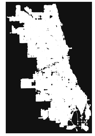
chicago = ox.graph_from_place('Chicago, Illinois', network_type='drive', simplify=True)
ox.plot_graph(chicago)
chicago = ox.add_edge_speeds(chicago)

# calculate travel time (seconds) for all edges
chicago = ox.add_edge_travel_times(chicago)

edges = ox.graph_to_gdfs(chicago, nodes=False)
edges['highway'] = edges['highway'].astype(str)
edges.groupby('highway')[['length', 'speed_kph', 'travel_time']].mean().round(1)
from shapely.geometry import Point, LineString, Polygon
from descartes import PolygonPatch


trip_times = [5*60, 15*60, 30*60] #in seconds

iso_colors = ox.plot.get_colors(n=len(trip_times), cmap='plasma', start=0, return_hex=True)

isochrone_polys = []


for trip_time in sorted(trip_times, reverse=True):
    subgraph = nx.ego_graph(chicago, origin_node, radius=trip_time, distance='travel_time')
    node_points = [Point((data['x'], data['y'])) for node, data in subgraph.nodes(data=True)]
    bounding_poly = gpd.GeoSeries(node_points).unary_union.convex_hull
    isochrone_polys.append(bounding_poly)
node_colors = {}
for trip_time, color in zip(sorted(trip_times, reverse=True), iso_colors):
    subgraph = nx.ego_graph(chicago, origin_node, radius=trip_time, distance='travel_time')
    for node in subgraph.nodes():
        node_colors[node] = color

nc = [node_colors[node] if node in node_colors else 'none' for node in chicago.nodes()]
fig, ax = ox.plot_graph(chicago, node_color=nc, node_alpha=0.8,
                        edge_linewidth=0.2, edge_color='#999999',figsize = (12,12))
8. Spatial Optimization using the P-median Problem
Let's say we would like to place a number P of facilities while minimizing the total weighted distance of servicing all demands. Each node has an associated weight that represents the amount of demand at that nodes, we will use population because a health department is an important community resource.
Objective function: Minimizing demand-weighted summed over all facilities and demand nodes.
Decision variables: where to put the facilities and which demand nodes are serviced by which facility location
Constraints:
- Each node is serviced by 1 facility
- A node can be serviced by a facility at a certain location only if there is a facility.
- We must place p facilities
- Each node is either a facility or not.

il = gpd.read_file('./data/chicago_comm_pop/chicago_comm_pop.shp')
il.head()
#create demand and potential facility nodes
demand = np.arange(0,77,1)
facilities = np.arange(0,77,1)
#create a distance matrix
coords = list(zip(il.centroid.x,il.centroid.y))
d = cdist(coords,coords)
#here we use demand as the total population
h = il.Total_Pop.values
# declare facilities variables
X = LpVariable.dicts('X_%s',(facilities),cat='Binary')

# declare demand-facility pair variables
Y = LpVariable.dicts('Y_%s_%s', (demand,facilities),cat='Binary')
let's assume that we want to have 5 departments - change p if you want to build more or less
p = 5

prob = LpProblem('P_Median', LpMinimize)
Objective function: Minimizing demand-distance weighted summed over all facilities and demand nodes
h_i: demand at i; d_ij: distance between i and j
prob += sum(sum(h[i] * d[i][j] * Y[i][j] for j in facilities) for i in demand)
prob += sum([X[j] for j in facilities]) == p
This constraint implies that a demand node i can only be serviced by one facility
for i in demand:
    prob += sum(Y[i][j] for j in facilities) == 1
This constraint implies that that demand node i can be serviced by a facility at j only if there is a facility at j. It implicitly removes situation when node i is served by j but there is no facility at j.
for i in demand:
    for j in facilities:
        prob +=  Y[i][j] <= X[j]
%%time

prob.solve()

print("Status:", LpStatus[prob.status])
print("Objective: ",value(prob.objective))
rslt=[]
for v in prob.variables():
    subV = v.name.split('_')

    if subV[0] == "X" and v.varValue == 1:
        rslt.append(int(subV[1]))
        print('Facility Node: ', subV[1])
fac_loc = il.iloc[rslt,:]
fig, ax = plt.subplots(figsize=(12,12))

il.centroid.plot(ax=ax,markersize=il.Total_Pop/500) # marker size is proportional to the population
fac_loc.centroid.plot(ax=ax,color="red",markersize=200,marker="*")
from shapely.geometry import LineString, MultiLineString
lines = []
for v in prob.variables():
    subV = v.name.split('_')
    if subV[0] == "Y" and v.varValue == 1:
        left, right = (int(subV[1]), int(subV[2]))
        line = LineString([il.iloc[left,:].geometry.centroid, il.iloc[right,:].geometry.centroid])
        lines.append(line)
gdf_lines = gpd.GeoDataFrame(geometry=lines)
fig, ax = plt.subplots(figsize=(12,12))

il.plot(ax=ax,column="Total_Pop") # markersize is proportional to the population
il.centroid.plot(ax=ax,color="black")
gdf_lines.plot(ax=ax,color="white")
fac_loc.centroid.plot(ax=ax,color="red",markersize=500,marker="*",zorder=2)
plt.axis('off')